Sunday 7 April 2013
Saturday 6 April 2013
Friday 5 April 2013
Dark Night Productions Cont.
The next step was designing a logo to go at the start of the film. We did have much time so weren't able to use an original photo that we hadn't taken ourselves and instead used Google images. The image we wanted was of a Victorian style lamppost preferably in black and white or a dark photo.
This is the image we selected in the end as it gave us what we wanted and more. It's in black and white and is of a lamppost but also it is off centre, which meant we had space to put the name of the company in the picture and it is at a canted angle which is used in film noir, further linking the company to the genre, and creates a disorientated effect for the audience.
Now we had our picture we had to add the text to it, to do this we used LiveType. LiveType allowed us to create effects with our writing so it wasn't just a still image. This made it look much more professional and realistic.

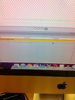
These photos show us using LiveType, adding our title and choosing the effect we wanted. We chose to use the effect Flicker as it related to the photo. Once we had done this we added it to our film on Final Cut and put the text in front of the picture. This is our end result, I think making it was very successful and it looks very good and professional at the start of our film.
This is the image we selected in the end as it gave us what we wanted and more. It's in black and white and is of a lamppost but also it is off centre, which meant we had space to put the name of the company in the picture and it is at a canted angle which is used in film noir, further linking the company to the genre, and creates a disorientated effect for the audience.
Now we had our picture we had to add the text to it, to do this we used LiveType. LiveType allowed us to create effects with our writing so it wasn't just a still image. This made it look much more professional and realistic.

These photos show us using LiveType, adding our title and choosing the effect we wanted. We chose to use the effect Flicker as it related to the photo. Once we had done this we added it to our film on Final Cut and put the text in front of the picture. This is our end result, I think making it was very successful and it looks very good and professional at the start of our film.
Creating Our Own Production Company - Dark Night
We needed to create our own production company for our film, this included a name and logo to put at the start of the film.
We wanted the name to be related to film noir so it looked liked this was the type of film that this production company would make. We had a few ideas but in the end we settled for 'Dark Night Productions'. To get this name we used things we had seen in other film noir films as inspiration, this way we knew it could be easily linked with film noir. For example in the film LA Confidential the coffee shop at which the murders take place is called the 'Nite Owl'.
This name has connotations of film noir as a convention of film noir is the night time and shadowy and dark lighting which the 'Nite' word covers. Therefore we also decided to use this word somewhere in our production company but we spelt it the correct way as you can make a more obvious link to film noir.
The other part of our name is also obvious, 'Dark'. It links to film noir in the same way as the other word does with the dark and shadowy lighting. Dark can also suggest evil, gloom and villains.
Thursday 4 April 2013
Wednesday 3 April 2013
Production Companies Research - Focus Features
Focus Features is the speciality films or
art house films unit of Universal Pictures. It both produces and distributes it’s
own films. It was formed in 2002. They have made films such as Brokeback Mountain (2005), Pride & Prejudice (2005) and Tinker, Tailor, Soldier, Spy (2011). However the most important and relevant to me and my group is Brick (2005). Brick is a neo noir that we looked at as a template for our own film. Brick is a modern film noir which we wanted ours to be, it is all in colour which ours is and it is set in a school, like ours. I think using Focus Features as a production company for our film will be good idea as they have produced a similar film before.
Monday 1 April 2013
Poster First Attempt
This is my first attempt of a poster for our film. Now I have completed one, I will look to add small details that will hopefully make a lot of difference and make it much more realistic. For example I'm yet to add our production companies logo.
Subscribe to:
Posts (Atom)


