This is the image we selected in the end as it gave us what we wanted and more. It's in black and white and is of a lamppost but also it is off centre, which meant we had space to put the name of the company in the picture and it is at a canted angle which is used in film noir, further linking the company to the genre, and creates a disorientated effect for the audience.
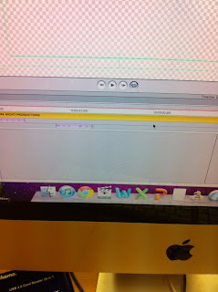
Now we had our picture we had to add the text to it, to do this we used LiveType. LiveType allowed us to create effects with our writing so it wasn't just a still image. This made it look much more professional and realistic.

These photos show us using LiveType, adding our title and choosing the effect we wanted. We chose to use the effect Flicker as it related to the photo. Once we had done this we added it to our film on Final Cut and put the text in front of the picture. This is our end result, I think making it was very successful and it looks very good and professional at the start of our film.


No comments:
Post a Comment